← All workCase study
Kingfisher Blue Properties
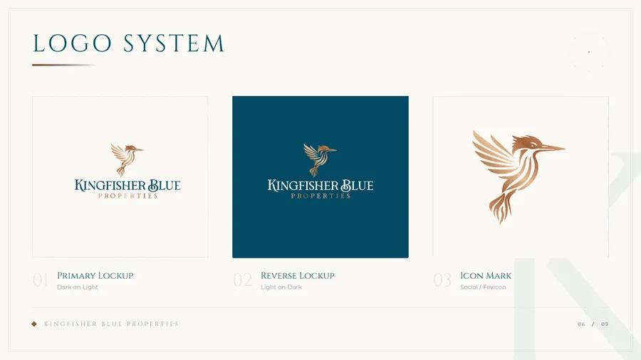
A practical brand system designed to make Kingfisher Blue Properties feel clear, credible and recognisable.
Context
One identity, every touchpoint.
Kingfisher Blue Properties needed an identity that could work beyond a single logo: something clear enough for everyday use, considered enough to build trust and flexible enough to carry across future materials.
The problem
Consistent, without every application feeling identical.
The brand needed a visual foundation that could be used consistently across property communications, presentations and digital touchpoints without making every application feel identical.
Thinking
Repeatable decisions, not a single style sheet.
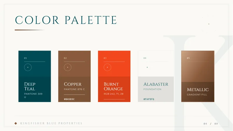
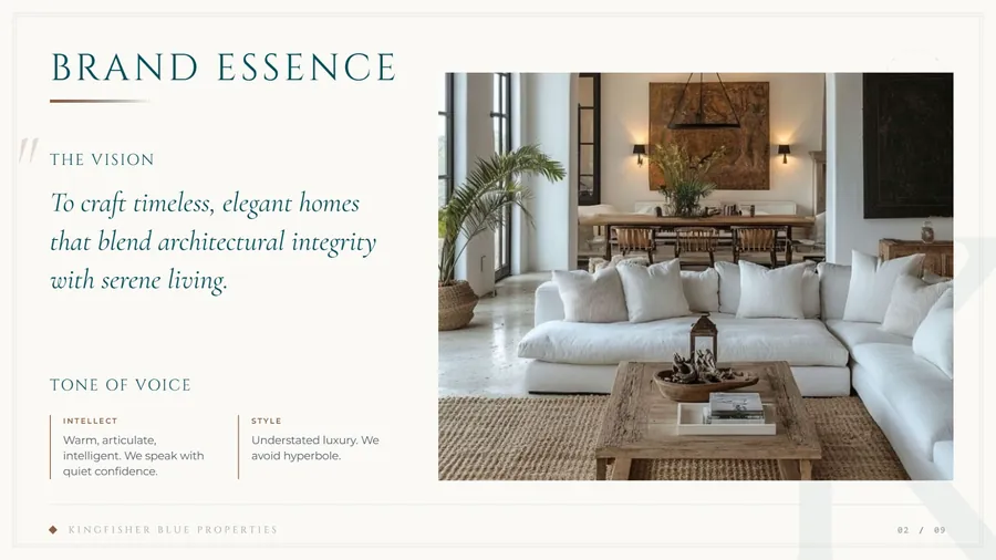
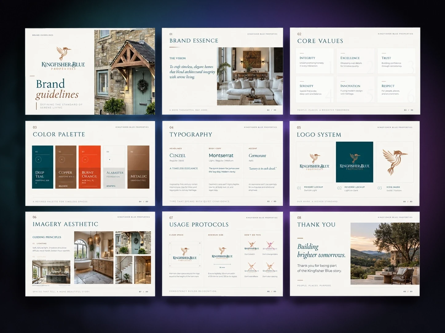
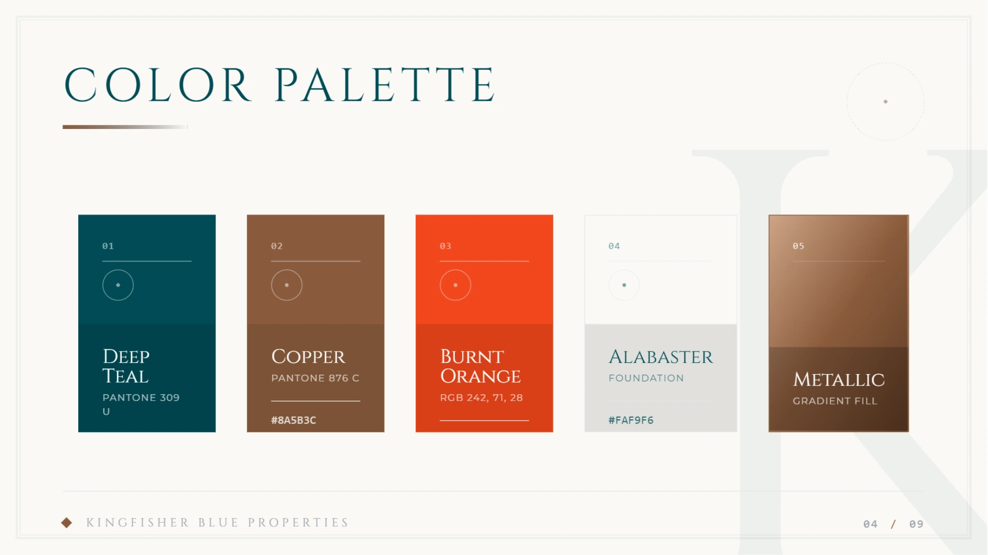
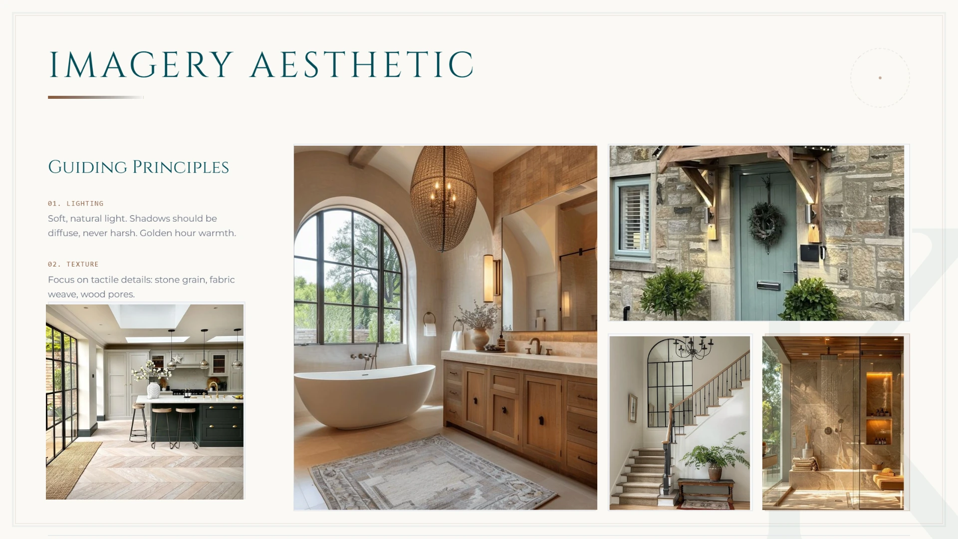
I shaped the identity around repeatable decisions: colour, typography, spacing, logo use, imagery and layout. The guidelines turn those decisions into something practical that can be followed as the business grows.
Key decision
Make consistency feel useful, not restrictive.
Why it matters
A good guideline system should help the next piece of work move faster while leaving room for the business to communicate naturally.
Design
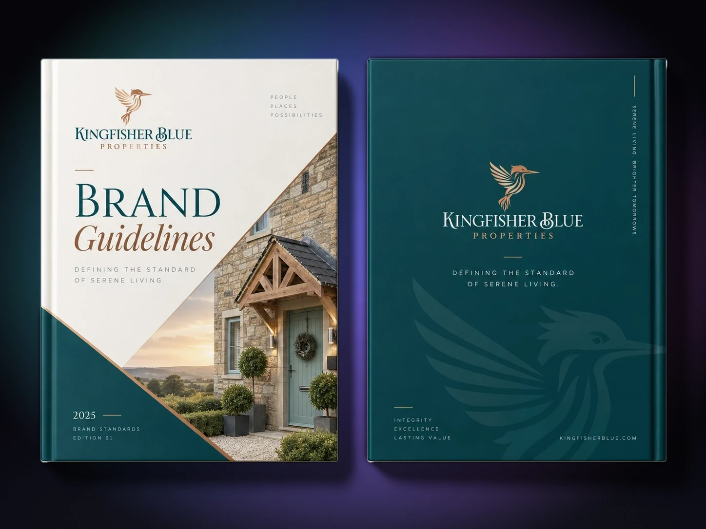
The guidelines, in full.
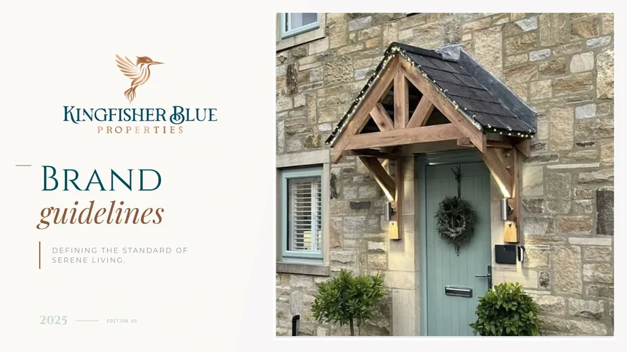
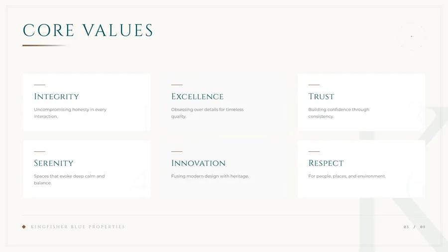
Nine pages, covering the full system.
Outcome
A clearer visual language, ready to grow with the business.
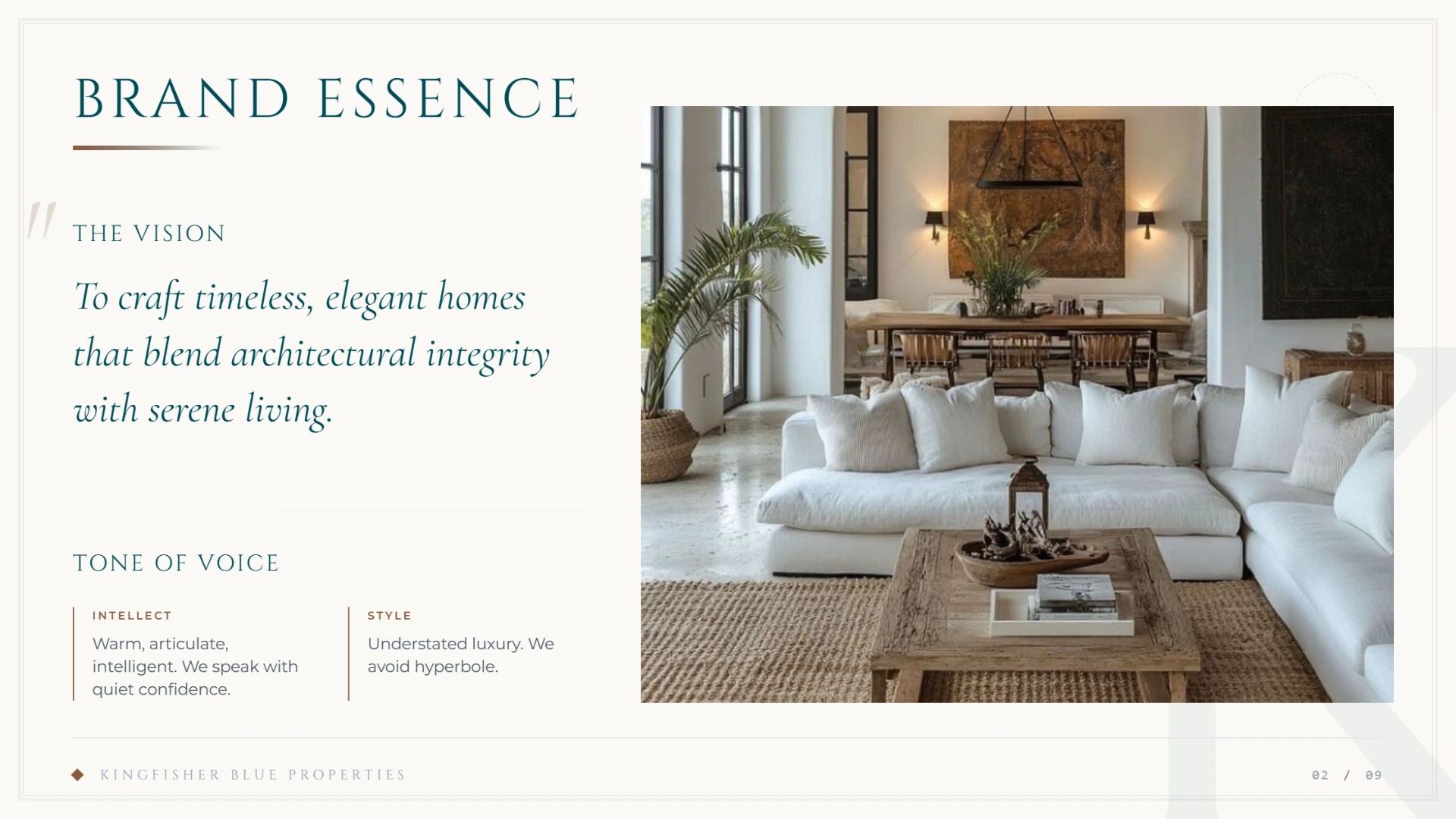
The result is a concise brand-guidelines document that gives Kingfisher Blue Properties a clearer visual language and a more dependable base for future communications.
Services
- Branding and identity
- Brand Guidelines
- Art Direction
- Brand & Content
Based in Kent
Mockups are illustrative: the designs are real, the scenes around them are staged.